Labels

Showing posts with label Jason Mahakian. Show all posts

Tuesday, April 5, 2011

Timeline/Training Log

It has been a long time since I last posted so here is an update on my progress thus far. The IP Show is about a week or so away and there is still a lot I need to do.

I am pretty much finished with the inside of the brochure. I have completed the race course timeline. It took me a lot longer to create this than I had originally imagined. I ended putting a lot more detail into each building/monument in order to create a more realistic look.


Now that I have finished illustrating every mile of the race, I can now look at it as a whole and decide if any changes need to be made before the exhibition. But, for now I need focus on the informational part of the brochure for the next couple of days. The next step is to finish the course map and hotel/restaurant map, followed by the first spread, finalizing the information, and cover/back designs.

I am still trying to figure out color in this piece. I know I want to use red and blue but I am not sure if these particular colors are working...

I recently had an idea of a take-away I could include in my final exhibition. I was thinking about creating another post card that had a little bit about the race on the back along with registration information. I would also include my contact information and website. I would create 26 different version of this post-card. Each one would have a different mile from the timeline. This way the illustrations would be bigger and more of the detail could be seen. This idea will have to be more of a last minute thing if I have some extra time before the show, but I think it would definitely is an interesting idea.

Monday, February 7, 2011

Artist Books / Program Information

Last Thursday, I went with Annette Haines to the Art & Architecture Library to look at some artist books that were developed using a variety of different folds. This was very interesting to see as I think about the construction of my booklet with efforts of thinking outside the usual constraints of book construction. A few of the books demonstrated some techniques that I would never have thought of and work well with my subject matter if tweaked. Here are some examples:


I will continue to think about how to implement different folding techniques into my project.

Also, I have gone through the previous program and the current website and have decided what information I think is necessary to include and what isn't. I have also started to work on the structure of the pages and started to sketch each page and the information it will contain. Here is an example of the structure I am planning on using:


Now that I have a intended structure, I will begin creating the program and filling it with information. Will post progress soon.

Wednesday, February 2, 2011

Development of the "Guide to Marathon Weekend"

Since the beginning of this semester, I have stepped away from the poster design and have started to develop the "Guide to Marathon Weekend". This is an informational program that tells the viewer/participant all the information they will need to know for the race. Last years included the different race distances, entry fees and deadlines, start times, hotels, restaurants, the course map, information about volunteering and the health and fitness expo and about "Conquered", the official after-party of the Detroit Marathon)

I have been going through the guide from last year as well as the current website and deciding what needs to go in such a manual and what can be cut. There is a lot of information that I believe would be beneficial to have in this program that is not in there currently.

Some of the things that I think would be beneficial are specific information about each different distance, more specific information about packet pick-up, race time limits, race restrictions, more unique aspects about the race (like first time marathoners getting a special bib color), etc.

Last years version seems very wordy without really telling the viewer anything important. The website has tons of information that I think could be conveyed to the viewer in this program in a simple and memorable way.  This is what I hope to accomplish with my version.

I also want to try and go beyond the current methods of race promotion. I want to make the program much more interactive. It will still be a printed material but will entice the participant to use it in a unique way.

In my experience, I have seen many runners, experienced and beginners alike, use a training log to record their progress while training for a race. My idea is to include a year-long training log/calendar in this program as a way to get the participant to constantly use and look at it. This will in turn, make them become more excited about the race while learning more about the race with each use.

I created a mock-up for how the program would look and work. My idea is that it will be a  12-page, 5" x 7" booklet that folds open into a 42" x 10" year-long training log/calendar. In order to save costs, everything that a participant would need to know or have would be included in this program. There were be a cover, 6 pages of information, 4 pages of maps and their keys, and 12 pages of training log on the back.

A few things I am currently wondering are if the idea of including a training log is practical and how much space is needed by the participant to write in for each day. I also am wondering if 3 and half feet is too long when it is completely unfolded. I hope to answer these questions by asking some runners to test the product and give me feedback.

Here are some examples of the structure of the booklet and an example of a page of the training log.


That is all for now. Much more to come.

Thursday, December 30, 2010

Tour of Detroit

This past Tuesday, I went on a tour of Detroit. My cousin, a tour guide, broke down the course map for me in terms of what one would see when running both the Half Marathon and Marathon courses. Then, we drove around Detroit, mostly on the course, as he told me about the different buildings and their history. Here are a few important things I took away from this tour:


  • Route mostly goes along the River including the E. Riverwalk stretch, Belle Isle, the Detroit-Windsor Tunnel and the Ambassador Bridge.
  • Course doesn't take in a lot of Detroit's major architecture. 
    • Fisher Building
    • GM Buildings
    • DIA
    • Detroit Public Library
    • Fox Theater
    • Comerica Park 
  • Thus, goal is not to take in Detroit's architectural highlights.
  • He suggested that I compare the Detroit Free Press Marathon route to other races that run the streets of Detroit (Race for the Cure, Turkey Trot, and the Tour de Troit).
Course Break Down
  • 1-3mi - West on Fort Street
    • Gets participants to bridge, not much else to see
    • view of bridge in distance
    • Fort St. Presbyterian (since 1855)
  • 3-4mi
    • Ambassador Bridge
  • 4-7mi (Canadian Shore)
    • Great view of Detroit Skyline & River
    • Longest stretch along the shore
  • 7-8mi
    • Detroit-Windsor Tunnel
  • 8-9mi
    • Renaissance Center
    • Hart Plaza
  • 9-10mi - to W. Lafayette
  • 10-11mi Lafayette to 18th
    • near St. Anne's
      • First Church built in 1701
    • Eastern most part of Mexicantown
  • 11-12mi - Bagley, Leverette, Lebrosse
    • Corktown
      • Historic Irish part of town
      • small 1800's homes
  • 12-13mi - Michigan Ave.
    • Abandoned Railroad Station
    • Former Tiger Stadium site
    • MGM Grand (New $800 million building)
    • Westin Book Cadillac ($200 million restoration)
    • to Campus Martius (Center of Downtown)
End of Half Marathon
  • 13-14mi 
    • Greektown
    • to "Lafayette Park" neighborhood
      • Urban Renewal, started in 1950's
  • 14-16mi - E. Lafayette
    • long stretch
    • across E. Grand Blvd to Indian Village
  • 16-18mi
    • Indian Village
      • Upscale 1900's homes
      • Residents love the runners, give them food, H20, and encouragement
  • 18-19mi - E Jefferson
  • 19-20mi - Cross MacArthur Bridge
    • 19-22mi - Belle Isle Loop
      • Amazing view of both Detroit and Windsor Skylines, Detroit River
      • Casino, atrium, aquarium, zoo
  • 22-23mi - Back over MacArthur Bridge
  • 23-24mi to E. Riverwalk for a half mile
  • 24-25mi Atwater 
  • 25-26mi Larned
    • to Finish on w. Fort Street
I now have a better understanding of the course and the buildings that participants will see. I also was able to get a better idea of the city of Detroit from a much different perspective. I believe this trip will be very beneficial in the development of my project. 


Tuesday, December 7, 2010

Screen Printing: Round 2

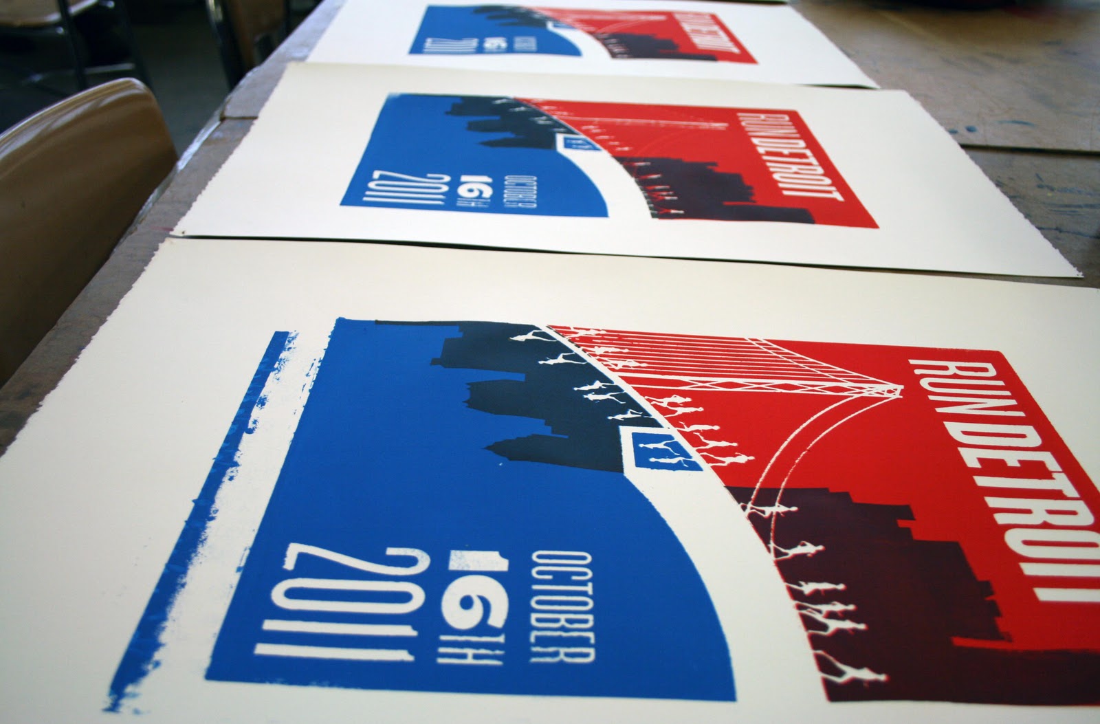
This morning, I added the finishing touches to my practice prints. I created a stencil for the Detroit and Windsor skylines and printed them on top of the prints. 

Last time, I mixed the extender into the ink which didn't do much to the opaqueness of the ink. Today, I added just a little bit of ink to the extender and it created a translucent look with the previous colors showing through. I think it is a little bit too translucent this time around but now that I know this works, I can work on perfecting the amount of each that I use. As I said before this is no where near where I want it to be but it seems like a good starting point. These iterations will be great to reference as I continue to develop my designs.

Practice Print - Finalized

Sunday, December 5, 2010

Screen Printing

This past week, I learned how to screen print on paper. Although this is far from my final iteration, I think it is a very good starting point. It let me figure out the process, the timeline and the limitations of screen printing.  I really like the imperfection that comes along with creating prints by hand. This experiment showed me that screen printing thin and small objects is very hard. I now know that I have to be very careful while washing the emulsion off of the screen in order to not get rid of any of the delicate lines. I also realize that weaknesses of have small negative space areas (like the runners). Some of the ink  bleed through the emulsion into the runners and distorted them. This showed me the issues with the process and my initial design. I now hope to solve these problems as I continue designing the poster. This time I printed with Acrylic Screen Printing Ink and found it to be a little opaque for my intentions and has the texture of acrylic paint. I am now wondering if there is an ink I can use that will be more transparent with the ability to soak into the paper without much of a texture. I will continue to do research on this topic in hopes of finding a better solution. All in all, I am happy with the outcome of this process and these initial prints and look forward to continuing down this road. 

My next step this week will be adding the buildings to the background. This will show me the strengths and weaknesses of adding a second layer to the prints. 

Below are some images of the different steps I took to screen print on paper:

Print on Vinyl

Silk-Screen

Practice Prints

Thursday, November 18, 2010

In-Class Critique (11/16/10)

As I mentioned in my previous post, we are having in-class critiques this week. I presented my progress to the class thus far on Tuesday and got some good feedback and suggestions from my professors and classmates. Below is the material I presented to the class:

Large Print  (13" X 19") - a look at Scale

Sample Sheet - Color Exploration

The Progression of the Posters

My classmates had some very good comments that address some of the concerns I have been having. 

They suggested that the reversible aspect of the poster might be a little bit too literal and not necessary. Michael brought up the point that once a poster is up, most people won't change its orientation. They thought the idea of duality was interesting but not successful in this aspect of the campaign, that using it for a postcard or button might be a better application of the idea (something that is frequently handled). They also suggested that I try a horizontal orientation rather than vertical, due to the nature of the material I am dealing with. 

It was also mentioned that I should start to develop the other materials of the campaign simultaneously. This way I won't be stuck following set guidelines but can change things as I see fit (what works and what doesn't) with each different element of the campaign.

I will keep all of this in mind, as I go back and continue to work on the posters and the entire campaign. 

Sunday, November 14, 2010

A Look into Our Past

This past Thursday, our IP section went on a field trip to the Henry Ford Museum. When I initially found out that we were going to go on there, I was excited for the experience but wasn't exactly sure what they would have that would specifically pertain to my project. I was surprised to realize that it was a perfect place for inspiration. Among the classic cars, vintage furniture and antique products, there were many forms of graphic design (ie. posters, advertisements, brochures, etc.) dating from the early to mid-twentieth century. Here are a few examples of designs I plan use as references when I explore typography, color, and imagery while developing my campaign.


I will now go back to my designs with these in mind, thinking critically about each decision I make in order to successfully evoke a authentic feel of the past. I am still working on more ideas for potential posters and from there will develop the rest of my promotional campaign. We have class critiques this on Tuesday and Thursday and I hope to get further feedback on everything I have done so far.

Please check back later this week for further development of my poster designs and the feedback/suggestions I receive about them. Thanks.

Sunday, November 7, 2010

Meeting with the Race Directors

This past Thursday, I met with the race directors of the Detroit Free Press Marathon to inform them of my project and ask them questions that would help in the development of my project as well as understanding different aspects of the race, I might not have known otherwise.

In preparation for my meeting with them, I created a rough presentation that defined the race, the objectives I hope to accomplish, my inspiration, and a couple versions of preliminary designs in order to show them in what direction I plan on heading.

Here is what I presented to them on Thursday:


The insight that Rich and Brian were able to provide was very interesting and will be very helpful as I continue the development of this project. Here are some key things that I learned during the meeting:
  • Current Promotion: Created race program and sent it out to past participants, sent it to running stores all over the countries, handed out at other race expos. They sent postcards to states that were farther away. One huge promotional benefit they have is having the Detroit Free Press and all of its products at its disposal. They can also use ad space in other newspapers (like USA Today) at a discounted rate.
  • Capacity: 21,000-21,500. A couple things that restrict the number of participants are the use of the Ambassador Bridge and the Detroit-Windsor Tunnel; This is because there will ALWAYS be construction on the bridge and they need to reopen the tunnel at 10am. 
  • No International: Not exactly sure of the reason for the drop of international but don't feel like it is necessary to have it in the title. Already established as an international race. Over the last couple of years, they had been experiencing an identity crisis. People weren't exactly sure what the race was called. They are trying to establish a sense of place (Detroit) and cohesive branding. 
  • Fastest Growing Race: Stat was specifically about the Marathon distance. Not necessarily the fastest growing still.
  • Detroit's Bad Reputation: It affects the race somewhat. They mentioned that they hear people say that they won't run Detroit because they don't want to get shot. 
  • Destination Marathon: As we talked, it seems like they share my views that Detroit can, if it already isn't considered, become a destination race. It has all the elements needed to be considered a great race.
Here are some other aspects of our discussion I found interesting:
  • Race is continuing to grow but the current goal is to create a sense of urgency. Make people want to sign up early. 
  • They try and treat everyone the same. All runners get the same benefits.
  • Runner's World voted the Underwater Mile (through the Detroit-Windsor Tunnel) one of the 26 Most Interesting Miles.
  • Competitor's magazine voted it the "Best Marathon for First Timers".
  • Race has ability to showcase city.
  • Most downtown stores and attractions embrace the race.
  • It seems to always be a grass-roots race and that it what is so great about it.
  • The race is an ambassador for the city, a part of its renaissance.
  • Create a sense of place, sum up Detroit, make it all about the city.
  • Event is organized around "just finishing".
It was a great experience to talk with them about the race and hear a different point of view than what I am use to. I have run so many races, it was nice to understand the thought that goes in to putting something like this on. I believe the information I have gained from meeting with them will prove very beneficial in the coming months. 

Goals for Week of 11/8 - 11/14
  • Use insight from meeting to continue to sketch poster ideas, develop campaign guidelines.
  • Research Diego Riviera and Olympic Posters.
  • Continue to research Detroit, Windsor, Marketing strategy, and early 20th century design.